Picture Montage / Touch Ups / Doctoring / Airbrushing
No other area of graphics work seems to attract so much interest
At Landis Media - we have been working with high end image packages and graphics for many years. Many of our customers ask about this area - probably because of its controversial nature. So we decided to open the doors and put up a case study.
We have a resident Russian artist who worked on this project and you can read his account of each image and the techniques he used. Click the links numbered in BLUE to move through the various slides. To "spot the difference" you may want to click backwards and forwards on some links - especially the final two. Anyway, over to Grigor:
1. Start - Its much cheaper to have an image created than using STOCK !
The customer required a vintage picture with a group of people and a FOR SALE sign behind. Using stock from sources like Getty is expensive and highly restrictive. You have to pay for each use you make on each mediafor an image. At no point do you own the image and therefore have to be very careful. A better option is to use an image which you already own and adjust the subject to fit the context. In this case study the customer had a family snap, but it required significant work before use. Once ready however, there are no limits on where or how many times the image can be used. We chose this example because it involved re-touching (fixing), extrapolation (creating new material), doctoring (adding details) and also montage (adding composite images).
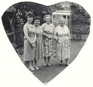
2. The Challenges - source
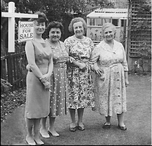
The image pictured here (as supplied) had some clear defects - the main one being no FOR SALE sign. The image had also been cut out into a rough shape and scribbled over with pen. The main positive being that the customer owned this picture and copyright wasn't an issue. To fix the image and make a vibrant vintage image with the right subject matter was going to be a tall order for anyone ! Luckily we have Grigor on the team, he is an experienced Russian compositor who had previoulsy worked for the KGB ! We dropped this into his lab, asked him to "work his magic" and sat back to await results. The rest of these slides are written by Grigor, his account of what he did.
3. Cut Down Image
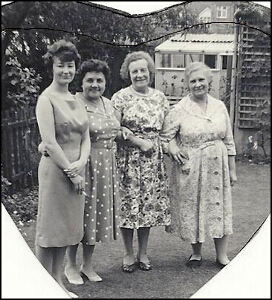
The first step was for me to cut the image out from the source material provided. In this "cropped" picture you can clearly see the lines a child scribbled onto the photo. The woman on the left and the right are both missing shoes, there are patches of grass missing as well. Some trees are also missing at the top and there is a cigarette in the first womans hand. Smoking is not shown in UK adverts and so this has to be removed also. When I started my career I used a scalpel and a photo enlarger to make pictures for Pravda. It makes me laugh that I am now using just me head and light on a screen. The most difficult part of this picture will be to get the grass looking good.
4. Re-touch rough
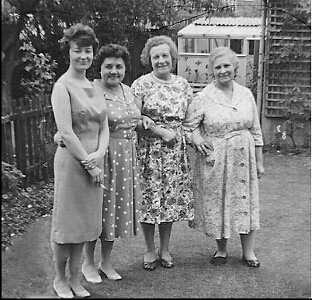
IN this picture I have done "roughed in" the missing parts - the way here is to get an idea of what it will look like. It doesnt matter if it is not pixel correct everywhere. I add grass, flowers, fence and the shoes. If you look at the grass you will see it is blurry which shows its been touched. I will fix this later but now I need to get the bits added. I have added to the picture left and right with more fence and trellis. I have copied the shoes from one woman to another. These are adjusted so that they dont look too much the same. There has been a big improvement here and I am ready to add in or "montage" the SIGN.
5. The for sale sign - source
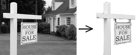
This is the source for the FOR SALE sign I use. You have to choose the picture to add very closely. Firstly it must be higher resolution than the bottom image. I can shrink it into the base photo, but I cannot make it larger or you will notice easily the work. Also the running line (perspective) must be the same, this is a good match here. Third the colours must be the same, even in black and white. If one is bright and the other dull, when you put them together this shows out. You see I have taken the sign out and it is ready to use.
6. Adding the sign
I have just placed the sign onto the bottom image. It looks very much "added" - an inexperienced artist would panic now, I do not as it will come good. The secret to "adding" to an image is to make added bits fit into the photo. I try to think in my head what I would see. If the sign was in this photo then it would be behind the fence and the lady and the bush. I have to make a bread sandwich from the layers and put the sign between two copies of the photo. I then carefully rub out the top layer so that the sign shows under it. I leave in the top the womans hair, fencing and the bush..
7. Blending Layers
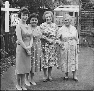
I start to blend the image in further - the sharp line behind the womans hair has gone and I am adjusting the shading of the sign as well. I still have the scribble marks, the "blurry" lawn and the grass to deal with. I notice many new artists would see this photo as ready. They also try to blend/blur around the photo they add. This is not good and it makes what you add look easy to spot.I now get ready to wok the final part.
8. Layering againn
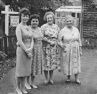
I am going to try and tell you what I have done here. I have copied the photo so I have two layers and the sign in a layer in between that. I carefully copy parts of the image onto the backdrop and slightly feather the edges of the sign. The ladies cigarette will also be removed by copying in the dress from the lady behind to where it would be if the cigarette wasn't there. You may want to flick by clicking between this and the final photo to see the changes. The differences I added between this and the final photo took me as long as all that was before. I always put the most effort in at the end to make it shine.
9. Final Touch
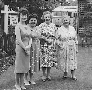
Well, here is the finished image and Grigor has done a great work on it. I would suggest you click back and forwards between this and the last picture and compare them. He has added in real grass, not blurred grass. He has coloured that with shadow and removed those scribbles as well. The cigarette has been removed and the sign is in place properly. I asked him about the work and if he used the retouch features on his paint package. He says not, because they are not precise enough. We think that you really cannot beat work like this for results. If you have a re-touch or project like this and want to see what it would cost then get in contact. I think that nobody who hadn't seen the original would guess this had been worked on. We also do work on peoples personal photos as well as business images.
These pictures tell a great story about this sort of work and its quality. Often people have a family photo which may need retouching, or repairing. We also work on images like this for clients who need a particular image but cannot either find one or afford one from "stock".
If you have some photo work that needs fixing or re-touching then contact us. Our rates are really very reasonable and the quality does of course speak for itself. Its a good investment to have some top notch images which you own and can freely use for business or privately. We do take work of this sort from companies as well as individuals - please enquire.
Typically we need a source image (though we can source additions) and an outline of what image you would like to achieve at the end. An image like the one shown above takes a lot of work is clearly more expensive to create than a quick re-touch.
